When you are working through a website development project, you are likely doing that work on a computer. Whether it’s a desktop or a laptop, you have a large screen, a mouse or trackpad, and all of the other features that come along with such a device. Since that’s the type of machine you are using while building the site, it’s easy enough to assume that your visitors will be using the same equipment.
That assumption, of course, is incorrect. Mobile traffic accounts for well over half of all visits to websites (if not more for many), meaning your primary concern should be how your site is going to work for people on phones or tablets. Not only is this important in terms of user experience, but it’s also critical to consider how mobile optimization is going to impact your SEO results.
In this article, we are going to focus on all things mobile optimization. If you feel that this part of your website is currently a little lacking – or if you simply have ignored mobile entirely while building and operating the site – now is the time to turn the appropriate amount of attention to this vital topic.
Why Mobile is Critical for SEO
If you need any motivation to prioritize working on the mobile version of your site over the desktop version, you don’t need to look any further than this next statement – Google predominantly uses the mobile version of a site’s content for indexing and ranking. That’s right, when Google is logging your site and deciding where it should be placed among the competition within the search engine rankings, it is making that decision based mostly on your mobile version.

So, for anyone playing the SEO game, mobile needs to be king. There is no other way around it. If you have been neglecting your mobile version and have been struggling to get the search ranking results you’d like to see, this might be the reason. It may not be the entire reason – SEO is complex and there are many ranking factors and variables involved – but a poor mobile version is sure to be holding you back.
As we mentioned in the introduction, mobile traffic accounts for more than half of all traffic on the web, so it makes sense that Google has adopted this approach. You still need to make sure your site works and looks good on a larger computer screen, of course, but mobile should be your primary focus. With a site that has been optimized for use on a mobile screen, you will be catering to the largest percentage of the user base, and you’ll have the best possible chance for growth moving forward.
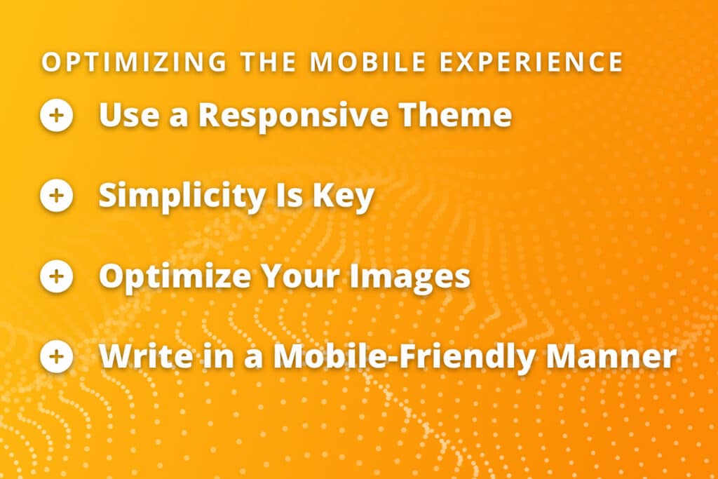
Optimizing the Mobile Experience
For a site owner or manager who has been focused primarily on their desktop version, optimizing for mobile can seem like a long and intimidating process. Fortunately, mobile optimization is conceptually simple and has been made even easier by some of the tools that are available for just this purpose. As long as you understand what you are trying to accomplish, it shouldn’t be too difficult to find either people or tools to make it happen.

The steps included in the list below can be considered a good starting point for dialing in how your site works on a mobile device.
- Use a responsive theme. For this point, we are going to assume that you are operating your site on the WordPress platform, as is the case for so many sites on the web today. If that’s true, you’ll want to be sure that you select a responsive theme that will automatically adjust the way your site is displayed based on the device in question. Fortunately, nearly all of the quality WordPress themes available today are responsive, so you won’t have to look far to find something that serves your needs in this area.
- Simplicity is key. It’s easy to let your creativity run wild when you are working on a large computer screen. There is plenty of space to work with on such a screen, so you might decide to add some extra images, play around with different backgrounds, and take other design liberties. That’s fine, but it could wind up harming the mobile experience in the process. On a small mobile device, you are far better off concentrating on the content and keeping the design elements as simple (and small) as possible.
- Optimize your images. You can still use images on your site when optimizing for mobile, of course, but you need to be careful with those files to make sure they don’t cause problems. Optimizing your website images is key. First, make sure the images have been properly compressed to bring their file size down as low as possible. A mobile device isn’t going to have the same onboard computing power as a larger machine, so you don’t want to tax it by asking the phone to load a large image file. Use any of the available compression tools to reduce file size without taking too much away from the quality of the image. Also, use a tool to adjust how big the image looks on the screen based on the device that is being used. It will probably take a bit of trial and error to figure out a balance that allows your images to look great without being too slow to load or intrusive on the page.
- Write in a mobile-friendly manner. You need to think about mobile devices, not only when you are designing your pages, but also when you are creating content. When you are hiring a writer to do that work, you should pass on instructions that will help them create content that is going to work on mobile. Specifically, it’s a good practice to keep both sentences and paragraphs short when writing something that will likely be read on a phone screen. If you present the visitor with a massive wall of text right when they land on the page, it’s going to be intimidating and they might just leave instead of diving in and reading your content. Also, since so little of the content will be visible on the screen when it first loads, it’s a good idea to get to the point right away. If you drag out the intro too long, the reader might lose interest and head back to Google to look for another option.
If you manage to hit these four points, you’ll be well on your way toward pleasing both your users and the search engines. A mobile-responsive site with a clean, fast-loading design ensures a user-friendly experience on phones and effectively serves this substantial user base.
Picking the Right Keywords
As you already know, keyword research and selection are a big part of SEO. If you are going to rank in the search engines for terms that are valuable to you and relevant to your audience, you need to know what to target when creating content. While the search terms you target will mostly overlap between desktop and mobile, there are some important points to keep in mind when you want to make sure to do a great job for the mobile segment.

Specifically, think about targeting keywords that are more likely to be used when someone is searching with their voice instead of typing in the text. When using a desktop or laptop, it’s most likely that someone will search by typing in the keyword that they wish to pursue. On a phone, however, it’s entirely possible that they will speak into the phone to complete the search – and that difference could alter the words they use.
Generally speaking, people are going to be more casual when talking as compared to typing. And, since talking is faster than typing, they will likely use more words than they would have otherwise. Look for so-called “long tail” keywords – those with more than a couple of words in the search – and favor those submitted in the form of a question. Experiment with creating some content that is targeted towards these kinds of searches and see if you notice a jump in mobile traffic as a result.
Nail Your Titles and Descriptions
One of the longest-standing SEO best practices is to write custom title and description tags for every page. These tags are important as they have a strong impact on the click-through rate that a page is able to achieve in the search results. If you have good tags and descriptions that are closely related to the content on the page and match with search intent, you should see more visitors.
As it relates to mobile traffic, be sure to favor shorter text in both of these fields. If your title or description rambles on too long, Google will likely rewrite it to fit and you will lose any advantage you might have gained by writing these tags from scratch. Aim for around 50 and 60 characters when writing titles and keep your descriptions under 120 whenever possible.
The Same, But Different
If you need a bigger goal to keep in mind while working on your site, remember that you should be trying to deliver the same information on both mobile and desktop, just in a different way. Your site’s pages are inevitably going to look a little different between these two versions, but do your best to make sure that each variant offers exactly the same thing. The content should be the same, the same pages should be available, and as many functions as possible should be present in both places. This will not only send good signals to Google about your site as a whole, but it will provide a solid user experience and avoid any unwanted surprises that confuse your users.
A website that looks and works great on a computer but can’t replicate that experience on a mobile device is never going to live up to its potential. To get the best possible results from your site in the months and years to come, you need to make sure that it can get the job done when visited on a smartphone or tablet.
Most Popular Articles

Seeing Favicons in Your Google Search Results? Here’s Why…
Have you noticed anything different in your Google Search results lately? Google added tiny favicon icons to its organic search results in January. It was…

AI or Agency? The pros and cons of a human touch vs artificial intelligence in web design
Your organization’s website is a critical marketing channel. It’s the first impression many customers have of your business and it plays a vital role in…

How to Use Email Analytics and Metrics to Measure Success
Email marketing remains one of the most effective digital marketing strategies, but success doesn't come from simply sending messages out into the abyss. To truly…


