Continuing our discussion of search engine friendly design considerations I offer you part 6 of a 6 part series on SEO friendly design:
Design your page with your goals in mind.
Part of SEO is allowing for easy feed subscription, encouraging links to your content, easy newsletter sign-up, clear membership information, ease of product navigation and easy access to contact information. Many people might wonder what this has to do with search engine optimization and I’m here to tell you that it’s all very important.
Your job when designing your website is to encourage links back to the content. You do this by providing ways for people to bookmark the site, subscribe via RSS and signup for a newsletter. This will keep your site “top-of-mind” with people that are interested in your content and ideally they’ll be reminded to read and continue to link.
One of the most popular and simple ways to encourage linking is to include an RSS feed and to provide a clear way to subscribe to your feed. If you use WordPress like I do, the feed is generated automatically. Services like Feedburner and Technorati can help you easily distribute your feed and allow easy subscription too.
There are many other ways to encourage linking and to stay top-of-mind and I won’t go into them here. But my point should ring true. When designing your page, make sure you provide ways to encourage linking and repeated visits to your content. Our goal is to encourage linking from high-quality sites.
Be consistent and present a sense of legitimacy.
Your design should have a cohesive feel, an appealing and appropriate “vibe” and a high quality, well thought out presentation throughout. This will also provide a strong sense of legitimacy that people need to return, subscribe and link. Obviously with a cohesive, well thought-out, consistent system, the search engines will be able to easily spider every page of your site too – which is our ultimate goal.
As web designers, our goal is to present our content in a way that’s easy and enjoyable to read. But an underlying goal is to present the content in a format that looks like someone actual cares about how the content is presented. A cohesive, well thought-out navigation scheme, a consistent identity and appropriate color scheme go a long way to encourage repeat visits. After all, as much as people think that content is king, there is a large majority of readers out there that need an enjoyable experience while they’re reading. I personally subscribed to a online networking site the other day over several others because the image of the site was more hip and enjoyable. I knew if I was going to spend any amount of time on the site that I would have to enjoy my time there. I did subscribe to another networking site and I haven’t been back since because it just didn’t present a feeling of quality and fun.
That experience includes color choice, font size, font type, intuitive navigation, simple subscription tools and many others. In a nutshell, a sense of legitimacy and care for your presentation with the goal of appealing to your target audience. It’s the same reason that people choose one book over another based on the cover and why some people prefer large, hard cover books over smaller, cheaper paperbacks. It’s the same reason why I enjoy reading the PRINT version of “The Week” over a traditional newspaper. (Yes, I do subscribe to some traditional media) It has a very consistent layout and presentation, the type is clearly spaced and readable and it’s presented in a way that allows me to easily scan and get the information that I need each week.
The same is not true for other publications (which I will not mention here) which present their information as large chunks of content that appear differently each week/month. A newspaper is an example of a publication format that I hate. If the same information was presented in a consistent, high quality way I might enjoy going back to it. Reading a newspaper has always been work for me. It’s a clunky format, it feels cheap and low quality, the sections are always laid out differently, articles are broken up within different sections, the photos are low quality and the text is usually smaller and harder to read. I would read the same content and enjoy it much more on a website or in a nice glossy magazine because I enjoy the experience more.
Consider this when you’re building your website and content. An enjoyable experience will encourage repeat visits, links, word-of-mouth exposure, and prestigious awards if it’s done very well. All of this will surely help your SEO campaign and overall rankings in time.
Related Articles:
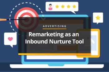
Remarketing as an Inbound Nurture Tool
Stop treating Remarketing like a sales pitch and start treating it like a nurture sequence. Your conversion rate—and your customers—will thank you. Move from "Product"…
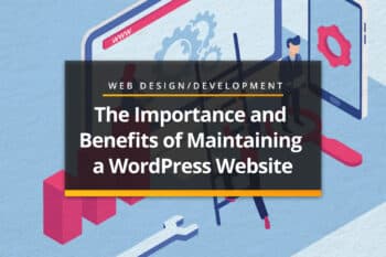
The Importance and Benefits of Maintaining a WordPress Website After…
Imagine you just bought your dream car. It is brand new, shiny, and in perfect condition. But instead of taking it home and parking it…

What B2B Marketing Looks Like When It’s Actually Helping Sales
One of the more interesting parts of sitting on the business development side is seeing how different companies think about marketing. Some view it as…
Most Popular Articles
Seeing Favicons in Your Google Search Results? Here’s Why…
Have you noticed anything different in your Google Search results lately? Google added tiny favicon icons to its organic search results in January. It was…

How to Use Email Analytics and Metrics to Measure Success
Email marketing remains one of the most effective digital marketing strategies, but success doesn't come from simply sending messages out into the abyss. To truly…

AI or Agency? The pros and cons of a human touch vs artificial intelligence in web design
Your organization’s website is a critical marketing channel. It’s the first impression many customers have of your business and it plays a vital role in…