
When building or redesigning a website, there are seemingly endless decisions to be made. From the layout of the pages to the content that you put on them and much more, it’s one decision after the next until the finished product finally comes together. Some people find this process exciting, and some find it frustrating, but every site must be carefully designed if it is going to accomplish its goals.
The colors you choose for your website will play a big role in how it performs, yet this element is often overlooked until the last minute. In this article, we’d like to get into the basics of color psychology and how it plays into buying decisions and customer interaction with your brand. There is a lot to learn about this important topic, so let’s get started!
Seeing the Big Picture
Before we dive into how colors impact marketing endeavors, we can first talk generally about the impact that colors tend to have on people. Different categories of colors will drive human emotions in a specific direction, often on a subconscious level. This is why, if you pay close attention, you’ll tend to see the same kinds of colors used by the same types of businesses. The people in charge of those businesses have done their research and know that the colors they pick are going to have a specific effect on the target audience.
Let’s look at some colors and the impact they often have:
- Black is a bold color that is typically connected to strength and authority.
- With red, you can evoke a variety of emotions, including romantic feelings, along with excitement and the desire to take action.
- Various gray shades will provide a calm, neutral feeling that keeps the viewer in a level, calm state.
- When hoping to bring out energy and optimism, orange may be the shade of choice. This is generally seen as a “happy” color, and yet feels a bit more mature than some of the other bright shades that can be used for the same purpose.
- Along the same lines, yellow is another positive color, with a happy association and a warmth that can be infectious.
- Blue is frequently a color selection when a calm, cool, and relaxed vibe is desired. As the color associated with water, a peaceful feeling can often be achieved by using blue in some form.
- The first thought with green is usually money, but that is only one way of thinking about this color. Other associations can include anything related to nature, and like blue, a peaceful and calm aura can also be created.
While the points above are a good generalized starting point, there is a lot of nuance to be considered here. First of all, there are many different shades within each color classification, and the range of tones can dramatically change how a given color feels. For example, a bright red can feel aggressive and active, while a deeper tone might have a more reserved, dark, and moody note. This is true of the range of shades within virtually every color, so pay attention to the shades you are selecting to confirm that they match with your goals for the project.
One other point to keep in mind is that the way you use given colors will also impact how they are received. You might use a lot of one specific color if you are trying to impact the mood of the viewer, while only a small section of another color could be employed if you want to highlight something important without taking away too much from the design as a whole. Always look for balance and experiment with various applications to find the best layout for any finished product.
Putting Colors into Action for Marketing Purposes
Now that we’ve taken an overview of what colors can do on an emotional level, it’s time to zoom in a little closer and think about how those emotions play into the marketing world. It’s no secret that you need to use emotions effectively when marketing, so tying in the role of colors to this process is a natural step.
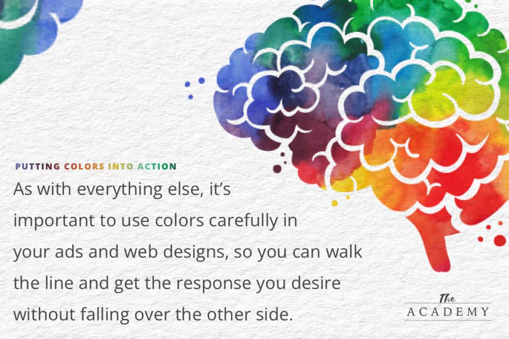
But you need to be careful. If you go too far with the use of color (in other words, if you manage to evoke too much emotion) you might find that the results are not what you had hoped or expected. As with everything else, it’s important to use colors carefully in your ads and web designs, so you can walk the line and get the response you desire without falling over the other side.
Here are some general tips for how colors can be used to successfully tune up your marketing materials:
- Red for urgency. If you pay attention to the colors used on other websites across the internet, you’ll find that red is often featured when the site owner wants the visitor to take action. A perfect example of this concept is the “Buy Now” button that might be found on a product page. While it’s not always the case, this button is frequently red, or uses red lettering, to promote the urgency that is desired to make a purchase right away. Since red is associated with excitement as well as urgency, it really is a great color to be used anytime you want to encourage someone to act in a specific way on your site. Of course, urgency can be useful for more than just making a purchase, as you might also want to use this color when trying to get signups for your mailing list, or even simply to highlight a section of the page that is particularly important and you don’t want to be missed.
- White space for focus and clarity. One of the easiest traps to fall into when designing a website is cluttering up the pages with too much “junk”. How many times have you landed on a website only to quickly hit the “back” button because the page just had too much going on for you to figure out what it was trying to say? Fortunately, this is a problem that the internet is gradually moving away from, as modern design trends are favoring a minimalist aesthetic that is easier to consume. In your own design efforts, value white space to give your visitor’s brains a break and help them focus on the important elements of each page. Rather than thinking of white spaces as boring, think of those areas as a place where the visitor’s eyes can go to reset and re-engage with the rest of the content.
- Black to establish authority. On pages where you would like to demonstrate your authority on a given topic, consider using plenty of black within the design. There is something professional and confident about the use of black, and staying away from too many bright, flashy colors will eliminate the risk of your page looking amateurish. You want to make your informational pages as strong and trustworthy as possible, as the use of black in the design is going to take you successfully in that direction.
- Blue is believable. There is a reason that blue is a color that is used in so many company logos; It is a shade that tends to conjure up feelings of trust in the mind of the viewer and potential customer. You might want to consider using blue as a theme color that appears in various places throughout your design, to be accented by some of the other colors we have mentioned when you want to achieve a specific goal.
The points above are a great starting point, but they are just a drop in the bucket of how you can use color to influence the people who land on your site. Think about the various ways you’d like to dictate site behavior and then look for the right colors to make that happen.
Applying These Concepts to Your Website
You should have plenty of ideas already, based on the discussion above, for how you can use colors on your website to improve the way it performs. To help you get started, we’d like to dedicate this last section of the article to going over how you can go from concepts and ideas to concrete action. In other words, what should you do today to help your website outperform past versions of itself?
Test Button Color
First, visit all of the pages on your site that have clickable buttons and review their colors. Are any of them blending in with the surrounding page too much to be easily spotted? Would red be a good choice for these buttons, or what about another bright color? This is likely to be an easy thing to change on your site, so it is a good place to get started experimenting with the impact of color. After you make some changes, monitor the performance of those pages to see if conversion rates are impacted in any meaningful way by the updated colors on the buttons.
Add White Space for Clarity
Next, go through all of your pages and look for places where you can add some white space to declutter the layout and make everything easier to read and more relaxing to use. You might add white space simply by opening up the gaps between elements, or you might take some existing elements off of your pages. Again here, you can experiment by adding white space to some pages first before checking on the results and proceeding as you see fit.
Consider Contrast
One other project you can work on is picking out a bold contrast color to add to your site in areas where you want to draw attention. For example, if you have a call to action section at the bottom of some of your info pages, pick a strong color to use as the background in that area. This is likely to pull more eyes to that part of the screen than a plain white background, meaning your CTA will be read more frequently than it was before.
Contrast also plays a role in website accessibility and making sure that your content is easily readable to people of all abilities.
Finding the right colors to use on your site, and where to use them, could take its performance to a higher level almost immediately. With some careful thinking about what you want each element on a page to accomplish for you, and with some testing to see how various changes perform, you can continue to dial in the design and work closer to your goals. Thank you for visiting and good luck!

Related Articles:

The Long Game: Why B2B Content Marketing Pays Off When…
A few months ago, I picked up bread baking. Not as a grand ambition, but as a desire to do more with my hands and…

The Most Valuable Inbound Marketing Content is Already Sitting Inside…
One of the most common challenges organizations face with inbound marketing is consistently generating content ideas. Not because there’s nothing to say, but because everything…

How to Discover and Report AI Traffic to Your Website…
Artificial intelligence is changing how people discover information online. Instead of relying solely on traditional Google searches, users are increasingly turning to AI-powered tools like…


Most Popular Articles

Seeing Favicons in Your Google Search Results? Here’s Why…
Have you noticed anything different in your Google Search results lately? Google added tiny favicon icons to its organic search results in January. It was…

How to Use Email Analytics and Metrics to Measure Success
Email marketing remains one of the most effective digital marketing strategies, but success doesn't come from simply sending messages out into the abyss. To truly…

AI or Agency? The pros and cons of a human touch vs artificial intelligence in web design
Your organization’s website is a critical marketing channel. It’s the first impression many customers have of your business and it plays a vital role in…