Accessibility is an important topic for all businesses. For a business with a physical location, it’s essential to comply with ADA regulations to make sure people with mobility limitations can get in and out safely.
While it’s easy to overlook, accessibility is just as important in the digital realm as it is in person. Website owners and operators need to consider the accessibility of their sites to ensure they comply with regulations so they can effectively serve all customers.
This article will dive into some of the many website accessibility mistakes that are commonly made and how they can quickly and easily be corrected. Let’s get started!
What is Website Accessibility?
Quickly, before we dive into a list of common mistakes, let’s make sure we are on the same page regarding website accessibility.
Website accessibility is simply using tools and technologies that are intended to allow people with disabilities to use the site. Those disabilities could include sight, hearing, movement, and more – accessible sites will use available tools to help all visitors overcome their challenges more easily.
It’s not only people with disabilities who can benefit from a focus on accessibility. Accessible sites tend to be easier for everyone to use, including those who have changing capabilities due to aging, those who have a limited internet connection, or even those who are using the site on a small screen.
Starting with Three Big Accessibility Mistakes
To get started talking about site accessibility mistakes, we want to first focus on three common issues that should be dealt with right away. If your site is currently guilty of any of these errors, or if you are launching a new site and want to avoid problems, these points would make for a good starting point on this initiative.
Poor Image Alt Text
One of the keys to quality site accessibility is having useful alt text for all of the images on your site. The key word there is “useful” – simply having alt text in place is not good enough if that text doesn’t do the job that it is supposed to do.
The point of having alt text is to describe what the image is showing for those who can’t see it. That could mean people who are visually impaired, or it could be someone using a device that won’t load the image for one reason or another.
Good alt text for images will get right to the point without any fluff. It should simply describe what is depicted in the image so anyone who isn’t able to see it will be able to gain a better understanding of the page as a whole.
Overloaded Navigation Bar
A navigation bar at the top of your pages with plenty of links to various parts of the site is a useful tool. But it’s possible to go too far with this web design feature. If you load the navigation bar down with excessive links, you could be inadvertently harming the accessibility of the whole site.
The problem here comes in when the navigation bar isn’t coded correctly to work with screen readers. Without the right coding, screen readers will get bogged down in the navigation and will take too long to get to the main content of the page.
Trimming down the navigation bar is a good start here, while also paying attention to the right coding methods. If there is a link that a user with a screen reader can use to skip over the navigation menu and get down to the main page content, that will go a long way toward improving accessibility.
Lacking Contrast
You have probably spent plenty of time considering all of the various design aspects of your site, from the layout of the content to the images and much more. Included in those design choices are selections about the colors that you will use to bring the site to life.
There are plenty of thoughts to keep in mind regarding color, including concerns over branding and visual appeal. One other consideration to remember is the contrast of how the colors work together and play off of each other. If there isn’t enough contrast between elements, it might be hard for some users to engage with the content and consume it properly.
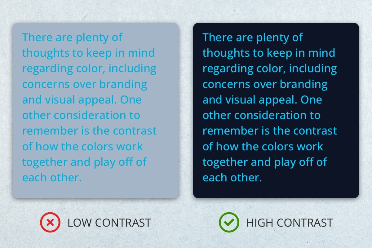
This is particularly true with regard to how the text and the background of the page work together. You want the text to stand out – to pop off the page – so it is as easy to read as possible. There are tools you can use to check the contrast and make sure you’ve hit the mark on this point.
Addressing Other Site Accessibility Issues
If you are able to successfully review and address the three issues we talked about above, you’ll be off to a great start. However, those probably aren’t the only accessibility matters to consider, so taking an even deeper look at how your site works can unveil other problems to correct.
Confirm Keyboard Navigation
Many of the visitors to your site who have accessibility needs will use keyboard navigation to get around the pages of the site. Keyboard navigation makes it possible for users who are unable to use a mouse or trackpad to get where they want to go.
As a site owner, you’ll want to test your site thoroughly to make sure it is working properly for keyboard navigation. Specifically, make sure that all areas and features of the site can be accessed when only using a keyboard. If some of your features can only be engaged by using a mouse, those areas will essentially be off-limits to anyone who uses a keyboard to get around the web.
One of the keys to good keyboard navigation is having the current focus area clearly highlighted when it is selected. Without a clear focus indication, it’s hard for the user to know which element is currently selected, and the experience the site offers will be frustrating. Don’t take steps to suppress focus indication for visual reasons as it is going to harm the accessibility of your pages.
Write Your Links Descriptively
When building site pages, it’s easy enough to get into the habit of using words like “Click Here” or maybe “Start Here” when creating links. That might be okay in some cases but don’t make a habit of using such generic language for your links, as descriptive text is better for accessibility.
You need to remember that users with accessibility limitations aren’t necessarily going to see your links in context. They may be using assistive technologies to sort through the available links on a page to pick out which one they want to follow. If those links don’t really say anything about where they lead, the site will be harder to use.
The solution to improving this accessibility element is to be descriptive with the text that you choose to hyperlink. State where the link will take the user so there is no confusion, even if the link is seen out of context. Not only will users with accessibility needs appreciate this touch, but so too will everyone else who lands on your site and benefits from clear labeling on links that take them where they want to go.
Use Headers Properly
Another fundamental part of site building is correctly using the various heading elements to organize the structure of the page. Again, this is a step that benefits everyone who comes to your site, not only as it relates to accessibility.
With a good hierarchy of headings, people using screen readers can easily move down through the page and see what it is all about. It’s a good idea to use proper headers on pretty much every page of your site, but it’s particularly important when you have a lot of content to share. For example, if you have a blog post of thousands of words, sprinkle plenty of H2, H3, and H4 tags throughout the page to organize all of that content logically and cleanly.
Also, from an SEO perspective, these headers are a great place to put some of the keywords you are targeting on the page. So, not only can you get an accessibility boost by taking the time to use header formatting, but you might be able to sneak up some of the search results at the same time.
Make All Documents Accessible
If you have some embedded documents on your site for users to engage with, make sure those elements can be accessed when the site is being used by someone with a disability. Depending on how you embed the documents, and what kinds of documents they are, they might not automatically be accessible.
PDFs tend to be a particularly big offender in this area. It’s pretty common to embed PDFs on webpages when you want to share information with your audience, but all of your audience may not be able to get at those documents easily. Take a bit of extra time to use an accessibility tool to check on whether or not the documents can be reached, and if not, consider adding an alternative way to get the same information to your visitors.
A Mobile Reminder for Website Accessibility
At this point in the history of the internet and websites, you probably don’t need to be told again that mobile users represent an important portion of your website audience. Yet, reminding you is exactly what we are going to do, because this topic is just that important.
There is a good chance that mobile visitors represent more than half of the traffic that lands on your pages. Depending on the type of site you run, that number might be well over 50%. Given that stat, you should be employing a mobile-first approach to how your site is designed and operated.
When you focus first on the mobile version of your site, you may spot accessibility mistakes or problems that you wouldn’t have seen otherwise. That’s not to say that you can just leave the desktop version of your pages out in the cold, of course, but starting with mobile and working from there is the right approach in this day and age.
You shouldn’t have to spend countless hours or huge sums of money to improve your site’s accessibility and serve the widest possible audience. We hope the information above has been helpful and good luck with this important project!
Most Popular Articles

Seeing Favicons in Your Google Search Results? Here’s Why…
Have you noticed anything different in your Google Search results lately? Google added tiny favicon icons to its organic search results in January. It was…

AI or Agency? The pros and cons of a human touch vs artificial intelligence in web design
Your organization’s website is a critical marketing channel. It’s the first impression many customers have of your business and it plays a vital role in…

How to Use Email Analytics and Metrics to Measure Success
Email marketing remains one of the most effective digital marketing strategies, but success doesn't come from simply sending messages out into the abyss. To truly…

