We’ve heard a lot lately about mobile websites, responsive websites, mobile marketing and having a ‘mobile first’ approach to your web design and digital marketing. Everyone at this point agrees that having a mobile website is important. But what does this phrase really mean?
What ‘Mobile First’ is not
Many believe that ‘mobile first’ means that you simply need to get yourself a website that’s optimized for mobile devices. Just ‘optimize it’, you know?
I think there’s still a large amount of people who think they need to develop a standard website and a second mobile version. This thought alone stops them in their tracks.
To some it means that you think about mobile being your main focus. Many people are developing websites that work good on mobile phones, but aren’t so effective on desktop computers. Mobile first does not mean disregarding desktop users.
I’ve even seen extreme cases where people have developed a site that completely disregards the desktop presentation in favor of a tiny interface that mimics a phone. In the example I saw, the developer completely hid important desktop interactions such as scrolling because they’re assuming that most users are able to move down the page using their finger!
Preparing your website presence for mobile visitors is important because the growth of users accessing information and not being tethered to a desk will be growing for a long time. But ‘mobile first’ does not mean developing a separate mobile website, focusing only on specific users and treating desktop visitors like they’re going the way of the dinosaur.
Mobile growth is huge, but we’re not even close to a point where we have the luxury of focusing solely on mobile visitors to our websites. Yes, we will still be using a mouse and sitting at a desk for many years to come in one form or another.
What does ‘Mobile First’ mean?
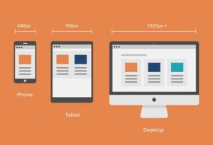
Mobile first simply means that you start developing your website user experience from the mobile visitor’s perspective and work your way back to the desktop — and even the TV. In the near future, experiences such as virtual reality may even require us to develop experiences that are larger than life.
‘Mobile First’ is a ‘Responsive’ approach to design which means that you start thinking about mobile users first, but you develop ONE effective RESPONSIVE website that’s laid out to deliver an effective experience for all users.
In his book titled ‘Mobile First’, Luke Wroblewski states: “Mobile design is the process of gradually applying constraints until an elegant solution remains.”
This is where you start.
This simply means that you begin with a focused, minimalist approach. What a user experiences on their phone is exactly what they need for that device and then as you move to tablet, laptop, desktop and beyond. You ‘enhance’ the experience in ways that benefit the user based on their screen size and their place in the world.
All visitors to your website are important. Not just the people on a mobile phone.
Why a ‘Mobile First’ Responsive approach to website design?
Efficiency:

First off, we don’t want to build and maintain more than one website. Can we agree on this? Ok.
Removing Limitations:
Designing for mobile doesn’t have to be limiting. It can also help you think through ways to enhance your user’s experience and encourage mobile use. You can incorporate location detection, capture and input from a camera and connections through Bluetooth Proximity detection (device closeness to physical objects) just to name a few.
Responsiveness:

Starting with mobile helps you to design something that will work well anywhere, not just on mobile devices. Responsive website design is the the future. Not separate mobile website solutions.
Speed:
Thinking about mobile users first also forces you to make decisions early that will affect important things like the speed of the website.
Focus:
In ‘mobile first’ UX design, we’re forced to focus on the most essential elements of the presentation that fulfill our main goals.There simply isn’t room for everything. A ‘mobile first’ approach forces us to articulate our goals and cut everything else. It’s so much easier to just throw everything on the site and hope the user stumbles through the clutter. An ideal ‘Mobile First’ approach forces us to strip our site down to the essentials and then ‘enhance’ the experience later if needed.
Simplicity:
Lastly, many people these days have an attention span of a 12 year old child. They’re busy, they’re distracted, they’re basically one eyeball and a thumb on a mobile device and barely more than that in the office and at home. Starting the design process knowing that this is your target audience will help you to simplify, simplify, simplify right out of the gate and apply that simplicity to all user experiences on any screen.
How Sanctuary Can Help With Developing a Mobile First Approach
Developing a mobile first approach requires a particular finesse and understanding of online technology and best practices. If you are looking for help with planning and implementing a mobile strategy, contact Sanctuary. We are located in the Historic Hoover District in North Canton, Ohio and serve the greater Akron / Canton area.

Related Articles:

What to Expect When You Hire a Digital Marketing Agency
Hiring a digital marketing agency is a strategic move that connects your business with experts who understand how to drive online growth. Whether you're looking…

What to Do When You Don’t Have a Marketing Team
Let’s say what nobody else wants to say out loud: You know marketing is important. But you’re already juggling 57 other things. Hiring a full…

Digital Marketing: It Starts With SEO
When we think about effective marketing, our minds are often drawn to a funny Super Bowl commercial or a clever meme being used for advertising…


Most Popular Articles

Seeing Favicons in Your Google Search Results? Here’s Why…
Have you noticed anything different in your Google Search results lately? Google added tiny favicon icons to its organic search results in January. It was…

Business Growth and Digital Marketing News & Tips 11-17-24
Are you encouraging and rewarding innovation? Lee Cockerell is the former Executive Vice President of Operations at Walt Disney World. A lover of traditional red…

Business Growth and Digital Marketing News & Tips 11-27-24
A culture of gratitude "Feeling gratitude and not expressing it is like wrapping a present and not giving it." – William Arthur Ward Beyond being…