What Makes an Effective Website Navigation?
A website without a reliable and easy to use navigation is doomed for failure. According to Contentsquare’s 2021 Digital Experience Benchmark report, the average time on page across all industries is 54 seconds. This means that if a user does not engage with something on your site within a minute, it is likely that they will move on to the next website in their search results.
A good website navigation menu is vital to retain users as it will allow them to find what they are looking for quickly and reliably.
Keep it Simple
What are the steps to create a good website navigation menu? First and foremost it is vital to keep it simple. A navigation menu with numerous links, cluttered layout, or poor color/design results in confusion and frustration for the user.
Your site’s navigation should follow a hierarchical design, functioning as a funnel for the pages, posts, products, or other information that your site provides. This should result in having as few links shown in the menu as possible which then contain drop down menus containing more specific pages related to the topic of the primary navigation link.
If there are too many choices then a user will often feel the effects of “choice paralysis”. For example, consider a simple site containing a blog. It would be a mistake to have every blog page linked in the main navigation as it could potentially lead to hundreds of links all crammed into the navigation. Even having the blog categories linked in the navigation would be a mistake, instead grouping everything together under one link named “Blog” which would contain a drop down menu that could further separate out the blog posts by category is best practice.
Avoid a Cluttered Menu

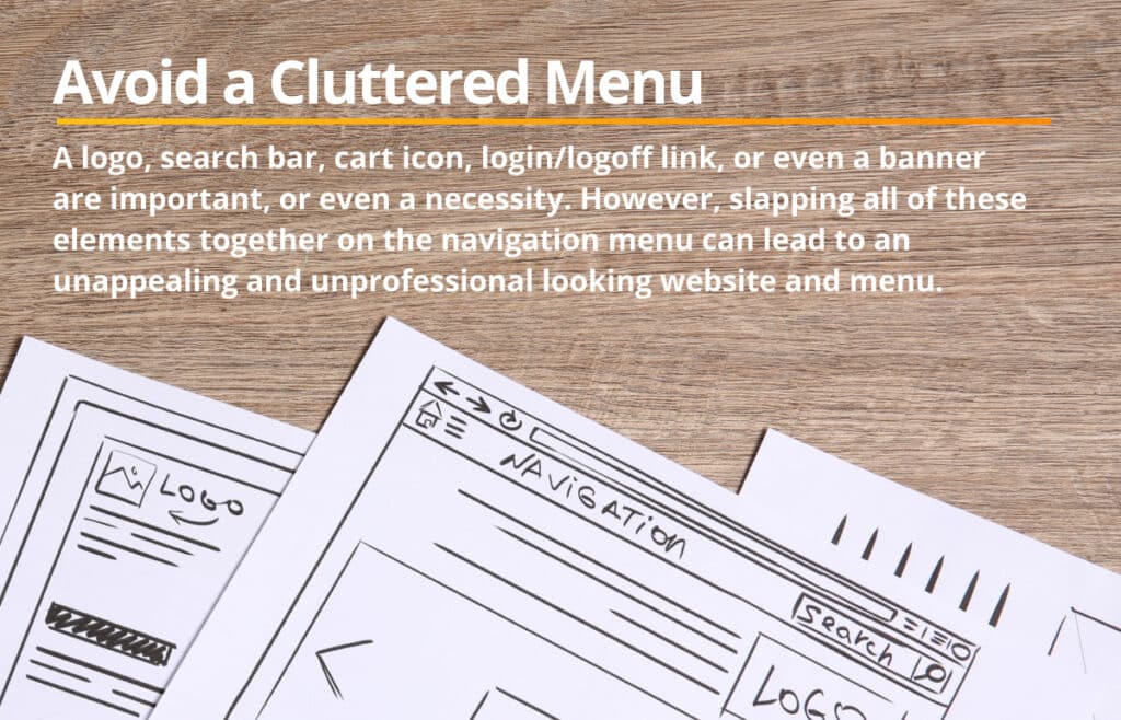
A navigation with too many links can lead to a cluttered layout, but there are other factors that need to be considered in order to avoid a cluttered navigation. Often a navigation will contain a logo, search bar, cart icon, login/logoff link, or sometimes even a banner. All these are important and depending on your site’s needs are a necessity. However, slapping all of these elements together on the navigation menu can lead to an unappealing and unprofessional looking website and menu.
In an attempt to avoid this you could separate out these elements and consider giving some of them their own space on the webpage. For example creating a sub menu or “banner” that is located above or below the main menu where you can place things like announcements, search bar, or even additional helpful links, like the cart, login/logout, or account pages.
A good menu should follow the best practices for web design like any other element or page of your website. This means more than just having a visually appealing navigation menu, although that is important. It means that you:
- Consider the typography of your links to ensure they are readable at a glance to streamline the process of finding the desired content of your website.
- Include alt text on your links to account for screen readers to ensure anyone with visual impairments can still reliably navigate your website.
- Use whitespace to your advantage. Keeping your navigation simple means that there will be plenty of whitespace to utilize to make the clicking area larger, reducing frustration for the user as they utilize the menu.
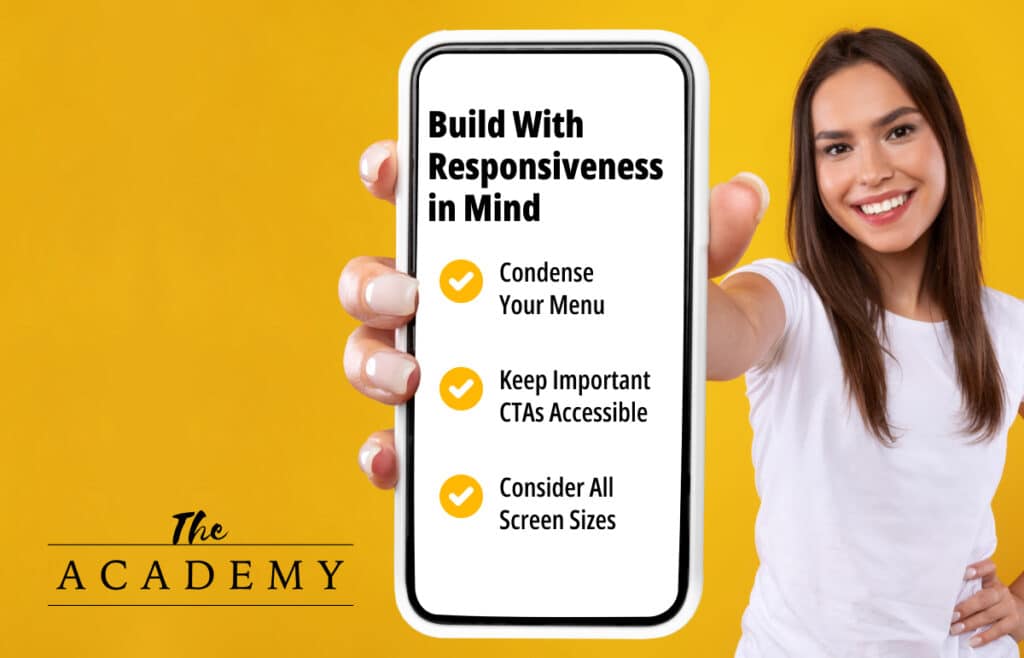
Build With Responsiveness in Mind
In 2024, responsive web design isn’t an option, it’s a necessity. If you want a successful website then it needs to be just as usable and user friendly on desktop as it is on a 6.5in smart phone. The menu is no exception as one that is only built for desktop will be almost, if not completely unusable on a mobile device. There are a few considerations that must be taken into account when it comes to your mobile menu.

Condense Your Menu
Consider using menu drop down, more commonly known as a hamburger menu. It has become standard practice to condense the main navigation links down into a single clickable icon that will expand or dropdown on the screen when clicked, revealing the navigation links. This greatly simplifies the navigation bar and allows for the links to be neatly tucked away when not needed allowing them more space on the screen only when they are needed. Because the hamburger menu is widely utilized across most mobile websites it will be recognizable to your user making it the perfect choice to simplify your navigation menu.
Keep Important CTAs Accessible
Second, consider what links or elements are the most important in your navigation that you may want to keep fully accessible instead of placing them behind a hamburger menu. A common practice may be to keep a single call-to-action (CTA) button in the navigation bar. This CTA would be a meaningful link that would either lead to the most important or frequently sought after information from your site, or it could be a link to allow for quick access for your users to continue down your marketing pipeline. Other possibilities could be keeping a cart icon in the header or the search bar depending on the goal and setup of your specific website.
Consider All Screen Sizes
Lastly, don’t forget to consider all screen sizes. When it comes to the discussion of responsive design it can sometimes be easy to think of just two screen sizes; desktops and mobile. However, with the continued development and use of even more devices capable of web browsing there are a huge number of different screen sizes. Even among mobile devices, the recent development of foldable phones and tablets should make us consider how we can create our navigation menus to be as responsive as possible.
Sticky and Hidden Menus
Standard menu placement is at the top of the webpage, meaning the user will have to scroll all the way back to the top of the webpage, which in most cases is not ideal. This kind of functionality can lead to fatigue and frustration for your users, especially if your webpages are long and contain a lot of information. Thankfully, there are a couple of solutions to this problem that are guaranteed to improve your site’s navigation usability.
Solution one is to make your navigation menu sticky. This simply means that the navigation bar will “stick” to the top of the user’s screen as they scroll down the web page. This allows for the navigation to overlap in front of all the other elements of the webpage resulting in the navigation menu to always be accessible to the user, no longer requiring them to scroll all the way to the top of the web page to navigate elsewhere on the site.
Solution two is a continuation of the first. This solution includes making your menu sticky, however, instead of always showing the menu at the top of the screen the menu will “hide” or “fold up” as the user scrolls, then as soon as the webpage starts to be scrolled back up the menu will “fold down”. This is a great solution if your menu is larger and takes up a considerable amount of space, especially for mobile devices. This solution can also be used in conjunction with the first. For example, if you have an additional navigation bar above your main navigation where you placed your search bar and other helpful navigation links. You can make the main nav sticky utilizing solution one, but make the top navigation hide on scroll using solution two.
This hybrid solution allows for your most important navigation menu to be accessible at all times, but still allows the top navigation to appear if needed, without scrolling back to the top of the page.
Go and Build It!
These are only three of many recommendations of what makes a good navigation menu. Perhaps the best way to improve on your design is to reference and take inspiration from other websites. Every site is different and could require special considerations, so getting a well rounded view of the possibilities will greatly improve the overall experience and design of your navigation menus. In the end, testing and retesting your navigation experience will help put yourself in your customers’ shoes and see your website from their perspective.
Most Popular Articles

Seeing Favicons in Your Google Search Results? Here’s Why…
Have you noticed anything different in your Google Search results lately? Google added tiny favicon icons to its organic search results in January. It was…

AI or Agency? The pros and cons of a human touch vs artificial intelligence in web design
Your organization’s website is a critical marketing channel. It’s the first impression many customers have of your business and it plays a vital role in…

How to Use Email Analytics and Metrics to Measure Success
Email marketing remains one of the most effective digital marketing strategies, but success doesn't come from simply sending messages out into the abyss. To truly…


