
 If you’re reading this blog on your smartphone or tablet, you’re not alone. Most of us are attached to our mobile devices and frequently use them to stay connected. Given the ubiquity of mobile devices, it’s kind of surprising that many business owners give little or no thought to ensuring that their sites are accessible via mobile. Like many business owners in Akron, Canton and the surrounding area, you may think a separate mobile website is the answer. A far better option, however, is one that’s built using responsive web design.
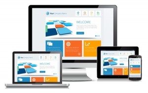
What is Responsive Web Design?
Responsive web design, or RWD, refers to using a single set of code to build a site that renders correctly and optimally across all devices. Whether an RWD site is viewed on a massive desktop screen or a tiny smartphone screen, it will adjust to be as easy to view and navigate as possible. RWD sites dynamically adapt to all platforms by using CSS data to manipulate maximum and minimum pixel widths to suit various screen sizes. Instead of using separate URLs – one for your desktop site and one for your mobile site – you can use just one. It’s much simpler, more elegant, easier to maintain and, most importantly, it delivers an optimal user experience.
Google Recommends RWD
From the standpoint of SEO, responsive web design is a big winner. In fact, at the 2012 SMX Advanced marketing conference, a leading Google trends analyst flat-out said that the search engine gives preference to RWD sites. Because a single set of URLs is used instead of several different ones for different devices, there’s a lot less confusion for people conducting online searches. Furthermore, more “juice” is accorded to various URLs on a RWD site because they’re not “diluted” from directing people to separate versions of the same site.
Increase Conversions with RWD
When people encounter a non-mobile-friendly site on their smartphones and other devices, they don’t tend to stick around very long. Therefore, sites that aren’t designed with mobile in mind tend to have abysmal conversion rates. With a responsive website, you can ensure that people who land on it enjoy the best browsing experience possible. They’re more likely to stick around, which means they’re more likely to convert. It’s a no-brainer.
Why’s Responsive Web Design so Expensive?
People often balk when given quotes for RWD services, but the costs are justified and the investment well worth it. After all, web designers employing RWD must take many factors into consideration and must put a lot of thought into how these sites appear across various platforms. In a way, they’re creating several sites for you at once. No wonder the bill seems a little steep! Moving forward, though, there will be less maintenance and upkeep since there’s only a single code set to contend with. Besides, conversions generally increase, so the return on the investment tends to be quick and considerable.
The bottom line? If you want your site to be accessible and convert visitors regardless of how they are viewing it, responsive web design is the way to go. If you need help implementing Responsive Web Design for your site, let us know. We’ll be happy to help!

Related Articles:

How to Discover and Report AI Traffic to Your Website…
Artificial intelligence is changing how people discover information online. Instead of relying solely on traditional Google searches, users are increasingly turning to AI-powered tools like…

The Problem With Boosting Posts and How to Fix It
The blue boost button on a Facebook post can be tempting. Why not gain some extra reach with just a few clicks? It seems innocent,…

Remarketing as an Inbound Nurture Tool
Stop treating Remarketing like a sales pitch and start treating it like a nurture sequence. Your conversion rate—and your customers—will thank you. Move from "Product"…


Most Popular Articles

Seeing Favicons in Your Google Search Results? Here’s Why…
Have you noticed anything different in your Google Search results lately? Google added tiny favicon icons to its organic search results in January. It was…

How to Use Email Analytics and Metrics to Measure Success
Email marketing remains one of the most effective digital marketing strategies, but success doesn't come from simply sending messages out into the abyss. To truly…

AI or Agency? The pros and cons of a human touch vs artificial intelligence in web design
Your organization’s website is a critical marketing channel. It’s the first impression many customers have of your business and it plays a vital role in…