
There are two distinct, but essential, elements that need to come together for a website to reach its potential—the content and the design. On the content side, we are talking about things like written content, images, graphics, videos, and more. Good content allows your audience to connect with your message and learn what you are all about.
It would be a mistake, however, to ignore the value of design in this equation. Sure, great content is a powerful tool, but only when it is presented to your audience correctly. In this post, we are going to take the time to highlight the key points that small business owners should consider when building a new website or having an existing site redesigned. By obeying a few key rules, you can come away with a site that will serve your visitors well time after time.
What is UX Design?
Before we get ahead of ourselves, let’s stop to quickly define UX design so we are on the same page for the rest of the article. UX is shorthand for user experience, and that pretty much says it all about what you are trying to accomplish with this type of design. UX design is all about elevating the experience for the users of your website.
So, in the process of UX design, you are keeping the user experience at the top of your priority list, ahead of any other considerations. For example, you might have some elements in mind that you think would look cool from a pure design perspective, but those elements may take away from how the site functions and is used by visitors. When you place UX as your main focus, you would skip those design pieces in favor of making sure the site provides the best possible experience to all who land on its pages.
With that backdrop for the conversation, let’s touch on some must-haves when you are trying to design a successful website with outstanding UX design fundamentals.
The User Experience Honeycomb
First, let’s take a quick detour and look at the User Experience Honeycomb that was created by Peter Morville.
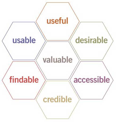
- Useful: Your content should be original and fulfill a need
- Usable: Site must be easy to use
- Desirable: Image, identity, brand, and other design elements are used to evoke emotion and appreciation
- Findable: Content needs to be navigable and locatable onsite and offsite
- Accessible: Content needs to be accessible to people with disabilities
- Credible: Users must trust and believe what you tell them
Peter Morville is president of Semantic Studios, an information architecture and findability consulting firm. He may be best known as an influential figure and “founding father” of information architecture, having coauthored the best-selling book in the discipline, Information Architecture for the World Wide Web.
Organization is Key
When talking about UX, it all starts with organization. By organization, we mean how everything on your site is organized, from the menus to the content on the pages and more. When a site offers a great experience to users, it is always well organized. While we consider all the items we’ve listed in this article to be “must-haves”, this one easily rises to the top of the list.
It’s best to think about this point from the user’s perspective when designing a site. As someone who works within a business—or maybe even owns the business—you inherently understand what your site offers, what you have to sell, etc. But that understanding is not possessed by someone who is landing on your site for the first time. They are just “meeting” you, in the digital sense, and they need to get to know what you are all about.
The hierarchy of your pages is the critical piece of your organizational efforts, as it should be quick and easy for visitors to find anything they need without delay. Do the menus at the top of your home page make it easy for visitors to find their way? What about when they enter your site on a page that is not the home page—can they navigate from that page to the other key areas of the site? You don’t want to make them work for it, because they probably won’t. If it’s hard to find what they need, the user will just leave and find a site with a better design.
Here’s a good rule of thumb for the navigation of your site—users should be able to get to almost every page in no more than three clicks. Depending on the size and structure of your site, you might not be able to stick strictly to that rule, but keep the goal in mind when laying out how your pages will be interlinked. You are on track for a positive user experience if everything you have to offer on the site can be accessed with just a couple of clicks or taps.
Make It Look Great
At some point in the UX design process, you might be tempted to fall down the rabbit hole of ruthlessly practical design. Instead of considering aesthetics, you could decide to do nothing more than optimize for function and make it easy for users to get the information they need.
Unfortunately, this approach would be misguided. Yes, sites should be practical and easy to use (as discussed above) but they still need to look great. Remember, this is often a potential customer’s first interaction with your brand, so what do you want them to find? A quality website that looks as good as it works shows that you put time and effort into the project, and that you care about the business as a whole.
Of course, beauty is in the eye of the beholder to a certain degree, so it’s up for debate as to what looks good and what should be redesigned. Some points that most people would agree look good on a website include the following:
- Clean design with minimal clutter and plenty of white space on the screen
- Not too many different colors competing for your attention
- Basic fonts that are easy to read
- Appropriate use of images to break up text and add value to the pages
If you just keep those four points in mind, you’ll be well on your way to a site that looks nice and pleases your users. One other point to keep in mind here, as trends change on the web, a site that once looked good might start to look and feel dated and stale. Monitor developments in web design as the years pass and don’t wait too long to give your design a facelift.
It’s Natural to Use
In our first section on the organization of your site, we touched on this idea of making sure the site is easy to navigate so all the pages can be quickly discovered. That’s important, but it’s not the end of the story. Your site should also be natural to use, and by that, we mean that it should function in a way consistent with the average website. If your design is way out of the ordinary and includes unusual features or elements, users might find it more frustrating than anything else.
Here’s an example to highlight what we are talking about on this point. Traditionally, around the web, when a button is used to display the price of a product, that button is clickable and will take the user to a sales page. If you add such a button but you don’t make it clickable, and instead you put the link somewhere else, users are going to be confused. This type of feature would not be natural to use, and it would almost certainly cost you sales.
Assuming you use the internet on a daily basis, as nearly all of us do, you should already be familiar with web customs and how websites are supposed to work. Keep those norms in mind and don’t go out of your way to be too creative or unique in your approach. Be consistent with how your site works so users aren’t surprised when they reach your pages.
Appropriate Calls-to-Action
Many people will say that the whole point of having a website is to encourage users to take a given action. That action could be a variety of things, from making a purchase to signing up for a mailing list, or something else entirely. Whatever it is, calls-to-action (CTAs) are the way to push them in the right direction.
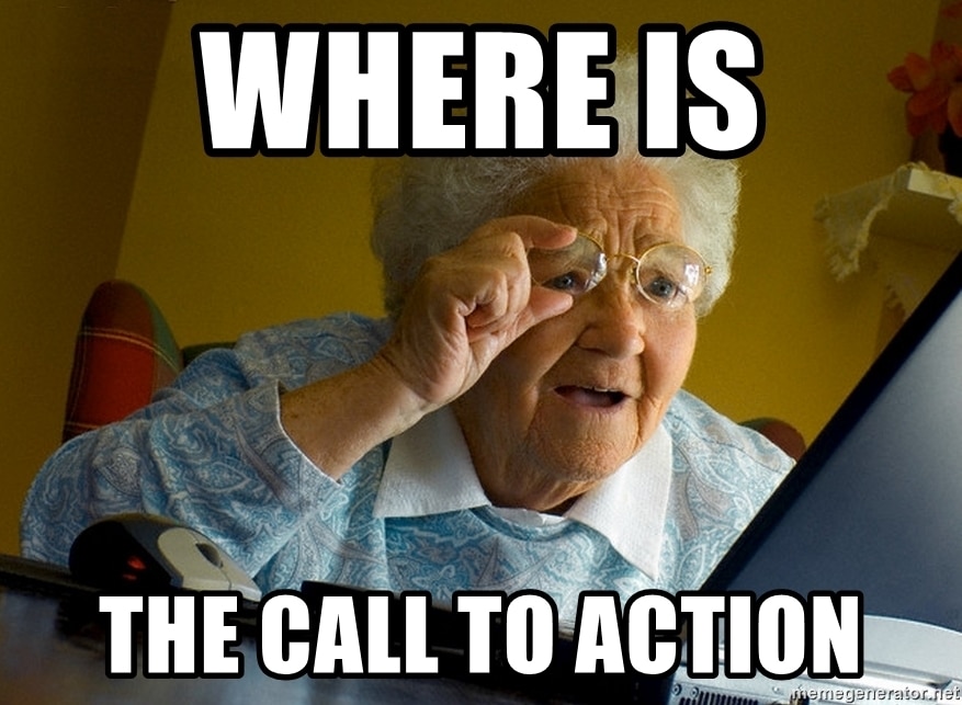
Mastering your CTAs is an important part of the user experience. CTAs that are too aggressive or too frequent will get annoying and may lead users to leave the site. Likewise, if there are no CTAs, users might not understand what you want them to do or what they will get if they take that desired action.
It’s walking this fine line that is one of your tasks when working on a UX design project. With the right amount of CTAs, you can deliver a clear message without being annoying. Likewise, the wording and presentation of those CTAs should be concise and direct without being pushy. It might take some time to master this art, but that is time worth spending because of the important role that a good CTA can play on a webpage.
Doing Your Research
You can only figure out so much on your own when it comes to UX design. In fact, it’s easy to get caught in a loop where you never actually make any decisions or improvements—you get stuck just going over the same points time after time, debating what is the right way to go. At some point, you need to get something out there so you can see how it works. It can always be changed later.
This is where doing research throughout the process can be a big help. In this application, research means asking people for their opinion on how the site works, what could be improved, etc. You might be able to reach out to some of your current customers for a beta test period of the new site, or this could be done in-house if you have a large enough business to have employees available who aren’t part of the site design project.
In having others try out the site and offer their input, you can request feedback on some of the points we have touched on above. Things like how easy it is to find various pages, how the site looks, and how it performs on their various devices would be good starting points for important conversations. You don’t have to make dramatic changes to your design just because one person says they find it hard to use, but if that is a theme that you get from one person after another, there is probably something about the design that needs to be changed.
Engaging a Professional
Knowing the right things to do can be very complicated when it comes to developing an amazing website experience. As we’ve discussed already, the experience involves all aspects of your website from how it looks and how you navigate the site, to how it reads and ultimately how credible it feels. The strategy around why you do what you do, across the board, is critical.
This is where it may make sense to engage a professional to guide you. Having an experienced professional firm help you to do all the right things the first time will likely be worth the investment in the longrun.

Related Articles:

How to Discover and Report AI Traffic to Your Website…
Artificial intelligence is changing how people discover information online. Instead of relying solely on traditional Google searches, users are increasingly turning to AI-powered tools like…

The Problem With Boosting Posts and How to Fix It
The blue boost button on a Facebook post can be tempting. Why not gain some extra reach with just a few clicks? It seems innocent,…

Remarketing as an Inbound Nurture Tool
Stop treating Remarketing like a sales pitch and start treating it like a nurture sequence. Your conversion rate—and your customers—will thank you. Move from "Product"…


Most Popular Articles

Seeing Favicons in Your Google Search Results? Here’s Why…
Have you noticed anything different in your Google Search results lately? Google added tiny favicon icons to its organic search results in January. It was…

How to Use Email Analytics and Metrics to Measure Success
Email marketing remains one of the most effective digital marketing strategies, but success doesn't come from simply sending messages out into the abyss. To truly…

AI or Agency? The pros and cons of a human touch vs artificial intelligence in web design
Your organization’s website is a critical marketing channel. It’s the first impression many customers have of your business and it plays a vital role in…