
In the world of digital marketing, the landing page stands as a pivotal gateway between visitors and conversions. A conversion landing page is exactly what it sounds like… a page dedicated to getting prospects to convert. This means that there’s a form on the page with a strong call to action (CTA). Conversion landing pages are crucial to your digital marketing strategy, especially when you are pushing a specific campaign or promotion. But if you’re relying on a form to track conversions, you must make sure that it’s set up correctly for accurate reporting of results.
In this article, we’ll dive into testing forms on conversion landing pages on your website. Explore why forms are a good conversion tool, the importance of placement of forms on the page, the setup of forms, and more. Join us as we uncover the secrets to creating forms that don’t just collect data but actively drive business growth.
Why You Should Use Forms as a Conversion Tool
Capturing your audience’s attention is just the first step. Converting that interest into action is where success truly lies. Enter forms—the unsung heroes of online interaction.
Forms aren’t just fields to fill; they’re gateways to deeper engagement and measurable results. Whether it’s gathering leads, processing orders, or collecting feedback, forms streamline interactions and turn casual browsers into committed customers.
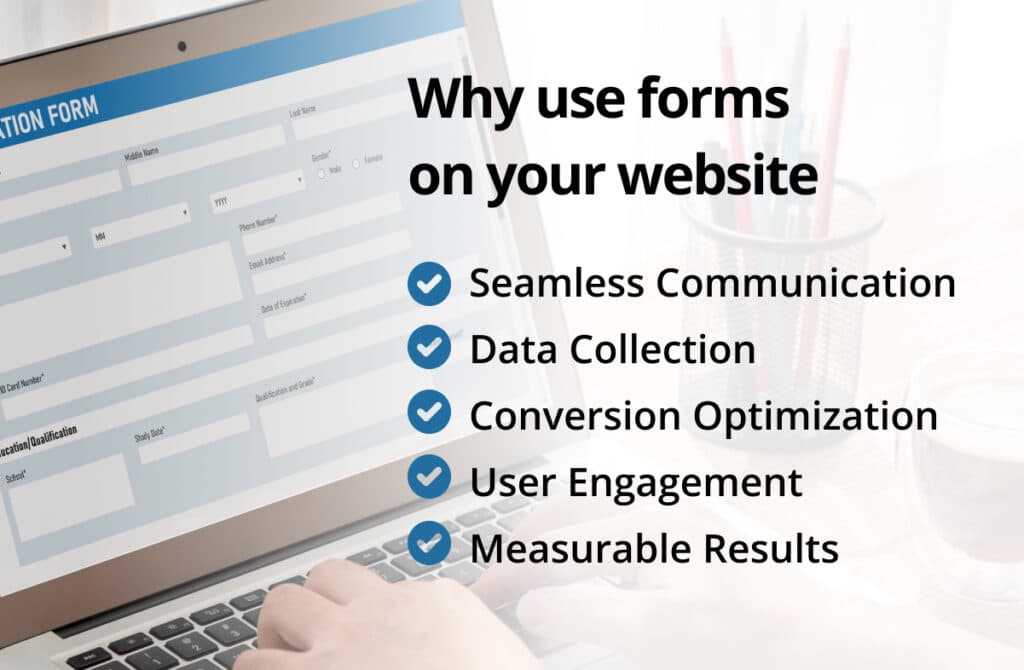
Why Use Forms?
- Seamless Communication: Forms bridge the gap between you and your audience. They provide a structured way for visitors to reach out, ensuring their inquiries are received and addressed promptly.
- Data Collection: Every form submission is a data point—a valuable insight into your audience’s needs and preferences. Use this information to tailor your offerings and enhance user experience.
- Conversion Optimization: A well-designed form guides users toward conversion. By carefully crafting each field and call-to-action, you can influence user decisions and increase conversion rates.
- User Engagement: Interactive forms keep users engaged. From simple contact forms to interactive quizzes, each interaction builds a connection and encourages repeat visits. You never want to leave a user searching for an action to take.
- Measurable Results: Forms provide quantifiable metrics for your marketing efforts. Track submissions, analyze patterns, and refine your strategy based on real-time data.
Elevate Your Conversions: Why Your Form Should Be Top Priority on Landing Pages
In the fast-paced world of online marketing, first impressions are everything. Your landing page is your digital storefront—a brief moment to capture attention and convert interest into action. If your page is a flop or it lacks actionable next steps, then you’re missing out on valuable engagement that could lead to gaining a new customer.
Placing your form strategically at the top of your landing page can make all the difference in achieving your conversion goals.
Here’s why forms should be front and center on your landing page versus hidden all the way at the bottom:
- Immediate Engagement: Placing your form near the top of your landing page ensures it’s one of the first elements visitors encounter. This primes them to engage with your offering without having to scroll or search, minimizing distractions and maximizing conversions.
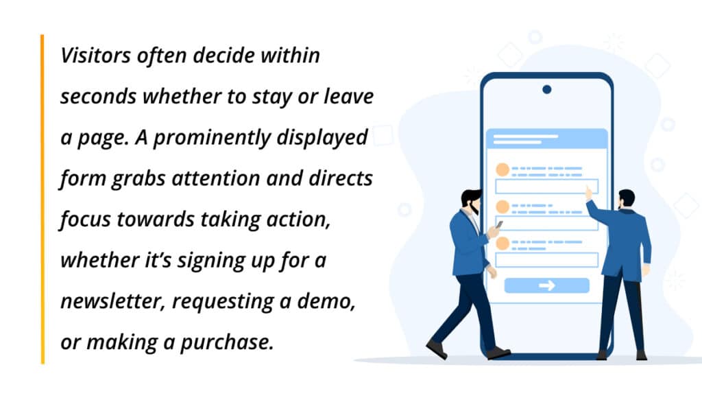
- Capture Attention: Visitors often decide within seconds whether to stay or leave a page. A prominently displayed form grabs attention and directs focus towards taking action, whether it’s signing up for a newsletter, requesting a demo, or making a purchase.
- Enhanced User Experience: Simplifying the customer journey is key to increasing conversions. Placing the form at the top reduces friction, making it easy for users to find and complete, especially on mobile devices where scrolling fatigue can impact engagement.
- Increased Conversion Rates: Studies show that forms placed above the fold typically result in higher conversion rates. By reducing the distance between interest and action, you capitalize on the initial enthusiasm visitors have when they first land on your page.
- Clear Call-to-Action: Placing the form prominently reinforces your call-to-action (CTA). Whether it’s a compelling headline or a persuasive offer, aligning it with an accessible form strengthens the message and encourages immediate response.
Best Practices for Top-of-Page Forms:
- Keep it Concise: Limit form fields to essential information to reduce abandonment rates.
- Mobile Optimization: Ensure forms are responsive and easy to use across all devices.
- Visual Hierarchy: Use contrasting colors and whitespace to make your form visually stand out.
- Test and Iterate: A/B testing different form placements and designs can reveal what resonates best with your audience.
Transform your landing page into a conversion powerhouse by prioritizing your form placement. Start optimizing today to drive engagement, capture leads, and achieve your marketing objectives effectively.
Utilizing Gravity Forms: Best Practices for Seamless Form Integration
Gravity Forms isn’t just another form builder—it’s a robust tool designed to streamline your data collection and enhance user interaction. Whether you’re gathering leads, processing orders, or conducting surveys, implementing Gravity Forms with finesse can significantly boost your efficiency and conversion rates.
Here are some best practices to maximize the effectiveness of Gravity Forms:
- Clarity in Purpose: Define the objective of your form clearly. Whether it’s capturing leads, gathering feedback, or processing payments, a well-defined purpose ensures you design your form fields and structure accordingly.
- Simplicity Rules: Keep your forms concise and focused. Avoid overwhelming users with unnecessary fields. Each question or field should serve a specific purpose toward achieving your goal.
- Logical Flow: Arrange your form fields in a logical sequence. Start with essential information and progress to optional details or additional actions. This intuitive flow reduces friction and encourages completion.
- Conditional Logic: Leverage Gravity Forms’ conditional logic feature to personalize user experiences. Show or hide fields based on user responses, guiding them through a tailored journey that feels intuitive and responsive.
- Mobile Optimization: Ensure your forms are responsive and easy to use on mobile devices. Gravity Forms adapts well to different screen sizes, but testing across devices ensures a seamless experience for all users.
- Visual Appeal: Design matters. Customize the look and feel of your forms to match your brand identity. Use colors, fonts, and styling options available in Gravity Forms to create a professional and visually appealing form.
- Security and Compliance: Prioritize data security and compliance with privacy regulations. Gravity Forms offers features like reCAPTCHA integration and GDPR compliance tools to protect user information and build trust.
- Integration Capabilities: Explore Gravity Forms’ extensive integration options. Connect your forms seamlessly with email marketing platforms, CRMs, payment gateways, and other tools to automate workflows and enhance data management.
- Testing and Optimization: Regularly test your forms to identify areas for improvement. A/B testing different form versions can reveal insights into what resonates best with your audience and improves conversion rates.
- Analytics and Insights: Utilize Gravity Forms’ reporting and analytics features to track form submissions, analyze user behavior, and measure the effectiveness of your forms. Data-driven decisions lead to continual improvement.
By following these best practices, you can harness the full potential of Gravity Forms to streamline operations, enhance user experience, and achieve your business objectives efficiently.
Optimizing Form Performance: Key Takeaways for Successful Testing
Testing forms on landing pages isn’t just about finding what works—it’s about continually refining and optimizing the user experience to maximize conversions. By conducting thorough A/B tests, analyzing user behavior, and iterating based on insights, you can uncover the ideal form layout, fields, and placement that resonate most effectively with your audience.
Remember, the journey from landing page visitor to engaged customer hinges on seamless interaction and clear calls-to-action facilitated by well-tested forms. Embrace testing as a strategic tool to refine your approach, boost conversion rates, and ultimately drive success in your digital marketing efforts.

Related Articles:

The Long Game: Why B2B Content Marketing Pays Off When…
A few months ago, I picked up bread baking. Not as a grand ambition, but as a desire to do more with my hands and…

The Most Valuable Inbound Marketing Content is Already Sitting Inside…
One of the most common challenges organizations face with inbound marketing is consistently generating content ideas. Not because there’s nothing to say, but because everything…

How to Discover and Report AI Traffic to Your Website…
Artificial intelligence is changing how people discover information online. Instead of relying solely on traditional Google searches, users are increasingly turning to AI-powered tools like…


Most Popular Articles

Seeing Favicons in Your Google Search Results? Here’s Why…
Have you noticed anything different in your Google Search results lately? Google added tiny favicon icons to its organic search results in January. It was…

How to Use Email Analytics and Metrics to Measure Success
Email marketing remains one of the most effective digital marketing strategies, but success doesn't come from simply sending messages out into the abyss. To truly…

AI or Agency? The pros and cons of a human touch vs artificial intelligence in web design
Your organization’s website is a critical marketing channel. It’s the first impression many customers have of your business and it plays a vital role in…