
Website design has evolved significantly since the early days of the internet. Not only have there been countless improvements in how sites function, but websites must also adapt to the wide range of devices accessing them. From desktop computers to smartphones—even screens on refrigerators—the variety of screen sizes, orientations, and configurations makes responsiveness essential.
Even if you don’t anticipate users visiting your site from a refrigerator screen, ensuring your website is fully responsive provides crucial benefits. Here’s why it matters:
Improved User Experience (UX)
A responsive design directly enhances user experience, ensuring seamless navigation across all devices.
Imagine this scenario: You’re searching for a local diner on your phone, find one that looks great, and click on their website—only to struggle with tiny, unreadable navigation, oversized images, and text that doesn’t fit the screen. Frustrated, you leave and choose another diner with a user-friendly site.
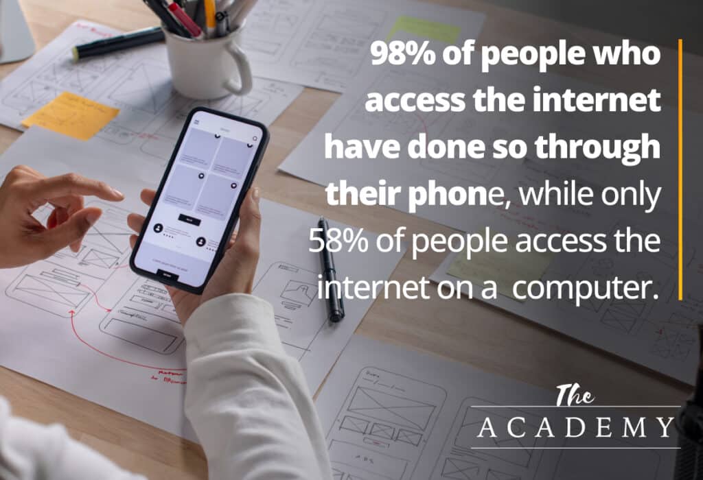
A poor mobile experience can drive potential customers away, regardless of how great your product or service is. With nearly 98% of internet users accessing websites via mobile devices (according to Statista), optimizing for mobile usability is non-negotiable. If your site isn’t responsive, you risk alienating a significant portion of your audience.
Better SEO Ranking
Google prioritizes mobile-friendly websites in its search rankings through its mobile-first indexing approach. A well-optimized, responsive site will:
- Improve your search visibility
- Lower your bounce rate
- Increase user engagement
Bounce rate is a key SEO metric—it measures how quickly users leave your site after arriving. If visitors land on your site but immediately exit due to poor usability, search engines interpret this as a negative signal, pushing your website lower in rankings. Ensuring responsiveness keeps users engaged and boosts your SEO performance.
Higher Conversion Rates and Sales
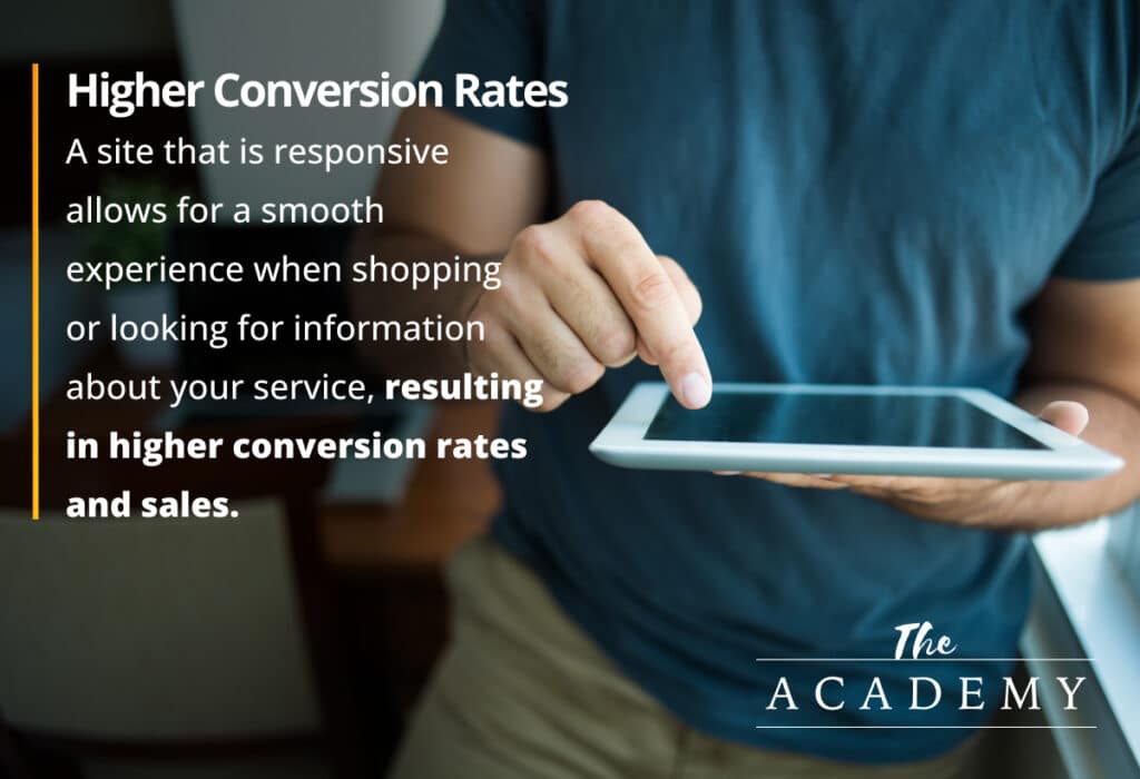
A well-designed responsive website doesn’t just keep users on your site—it encourages them to take action.
If you run an e-commerce store but fail to optimize for mobile, users will struggle to browse, find products, or complete purchases. Buttons might be too small, images could be misaligned, or navigation may break entirely. The same applies to service-based businesses—if your call-to-action (CTA) buttons are hidden, misaligned, or difficult to click, you’ll see fewer inquiries and conversions.
By ensuring a smooth, frustration-free experience across devices, a responsive design directly impacts sales and conversions.
A Responsive Website is Essential
In the past, having a responsive website was a “nice-to-have.” Today, with nearly half of all internet users accessing sites from mobile devices, it’s a necessity.
A responsive site ensures:
- A seamless experience across all screen sizes
- Better search engine rankings
- Increased engagement and conversions
It’s not just about aesthetics—it’s about functionality, efficiency, and ensuring your website serves its purpose effectively.
If your site isn’t responsive, you’re not just missing out on visitors—you’re missing out on business. Now is the time to invest in a responsive design that meets the needs of today’s users.

Related Articles:

The Long Game: Why B2B Content Marketing Pays Off When…
A few months ago, I picked up bread baking. Not as a grand ambition, but as a desire to do more with my hands and…

The Most Valuable Inbound Marketing Content is Already Sitting Inside…
One of the most common challenges organizations face with inbound marketing is consistently generating content ideas. Not because there’s nothing to say, but because everything…

How to Discover and Report AI Traffic to Your Website…
Artificial intelligence is changing how people discover information online. Instead of relying solely on traditional Google searches, users are increasingly turning to AI-powered tools like…


Most Popular Articles

Seeing Favicons in Your Google Search Results? Here’s Why…
Have you noticed anything different in your Google Search results lately? Google added tiny favicon icons to its organic search results in January. It was…

How to Use Email Analytics and Metrics to Measure Success
Email marketing remains one of the most effective digital marketing strategies, but success doesn't come from simply sending messages out into the abyss. To truly…

AI or Agency? The pros and cons of a human touch vs artificial intelligence in web design
Your organization’s website is a critical marketing channel. It’s the first impression many customers have of your business and it plays a vital role in…