Effective marketing emails require more than just compelling copywriting; you also need to design the email to capture the readers’ attention and encourage them to take action. With the average person receiving dozens of emails every day, your emails need to stand out while also remaining focused and functional.
Follow the best practices below to ensure that your marketing emails resonate with your audience and achieve your campaign goals.
Keep It Simple When It Comes to Email Design
Simplicity is key when it comes to email design. A cluttered or overly complex layout can overwhelm readers and dilute your message. Focus on a clean, streamlined design that prioritizes your key message, and use ample white space to make your email easy to scan.

Work Within the Constraints of Your Email Platform
While it’s certainly possible to design and code completely custom email layouts, the vast majority of the time you or your agency partner will build your campaigns within tools like Mailchimp, Constant Contact, or Hubspot. These tools streamline a lot of the tedious but critical work of email campaigns, like list management and segmentation, but often have limitations when it comes to email design. While potentially frustrating at first, understanding the design capabilities and limitations of these tools and working within their constraints is crucial. Doing so will help you focus on your campaign’s core message without getting bogged down in complex layouts or design flourishes. Remember: simplicity is key, and these tools can help remind you of this fact.
Test Your Responsive Designs
With the majority of emails now being opened on mobile devices, responsive design is essential. As mentioned earlier, tools like Hubspot can help optimize your email layout for various devices. Even when using these tools, it’s important to be intentional about your design choices and understand how they will look on a variety of screens. Testing your email is crucial. Different devices and email clients will render aspects of your email differently, so you may need to make some adjustments or concessions on your design to deliver a consistent experience for all of your readers.
Prioritize Email Readability
Users will often skim emails quickly, so readability is critical. Use a clear and legible font, typically between 14 and 16 points for body text, to ensure that your content is easy to read. Keep font choices to a minimum, sticking to two or three at most to maintain a cohesive look. Utilize high contrast between text and background colors to keep your text legible even for those with visual impairments.
In addition to the visual design of your text, consider the structure of your content. Use short paragraphs with clear headings, bulleted lists, and section breaks to make your email more digestible.
Leverage Visual Hierarchy in Copy & Design
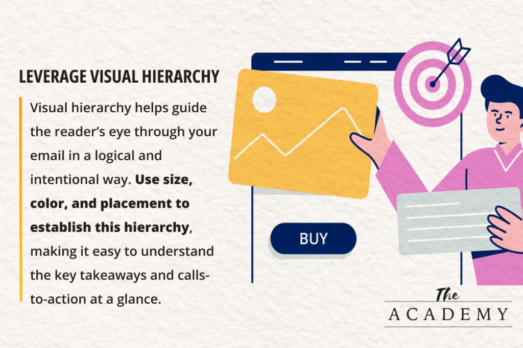
Visual hierarchy helps guide the reader’s eye through your email in a logical and intentional way. Start with the most important information, such as your main headline or offer, and then lead the reader through supporting content. Use size, color, and placement to establish this hierarchy, making it easy to understand the key takeaways and calls-to-action at a glance.

Incorporate Engaging Visuals
Images and graphics can significantly enhance the appeal of your email, not only making it more engaging, but also extending your brand’s aesthetic to your campaign. Use high-quality images that support your message and align with your brand.
While imagery can be a major boost to your email’s design, it’s also important to consider how images can affect performance. Too many images can slow down loading times, and not all email clients may display images correctly. Remember to add alternative (alt) text to your images so that their message is still conveyed even if they fail to load.
Optimize Your Call-to-Action
The call-to-action (CTA) is perhaps the most important element of your marketing email—it’s what you want your readers to do. Whether you’re asking your readers to “Buy Now”, “Register Today”, “Schedule a Consultation,” or simply “Read More,” your CTAs should be clear, action-oriented, and unambiguous. To make your CTAs stand out, use a contrasting color that draws attention, and style them as a button or link that is large enough to be easily tapped on mobile devices. If your email features multiple CTAs, consider designing them slightly differently to prioritize the higher-value action (“Buy Now” vs. “Explore the Collection”) to subtly guide your readers.

Effective email marketing strategies rely on designs that are a blend of simplicity, responsiveness, and engaging visual elements. By focusing on clarity, optimizing for mobile devices, and using a well-placed call to action, you can create emails that not only capture attention but also lead to higher conversions. By adhering to these best practices, you can craft compelling marketing emails that resonate with your audience and contribute to the success of your campaigns
Most Popular Articles

Seeing Favicons in Your Google Search Results? Here’s Why…
Have you noticed anything different in your Google Search results lately? Google added tiny favicon icons to its organic search results in January. It was…

How to Use Email Analytics and Metrics to Measure Success
Email marketing remains one of the most effective digital marketing strategies, but success doesn't come from simply sending messages out into the abyss. To truly…

AI or Agency? The pros and cons of a human touch vs artificial intelligence in web design
Your organization’s website is a critical marketing channel. It’s the first impression many customers have of your business and it plays a vital role in…


