Have you ever been redirected to another website after clicking on an ad or a promotional link?
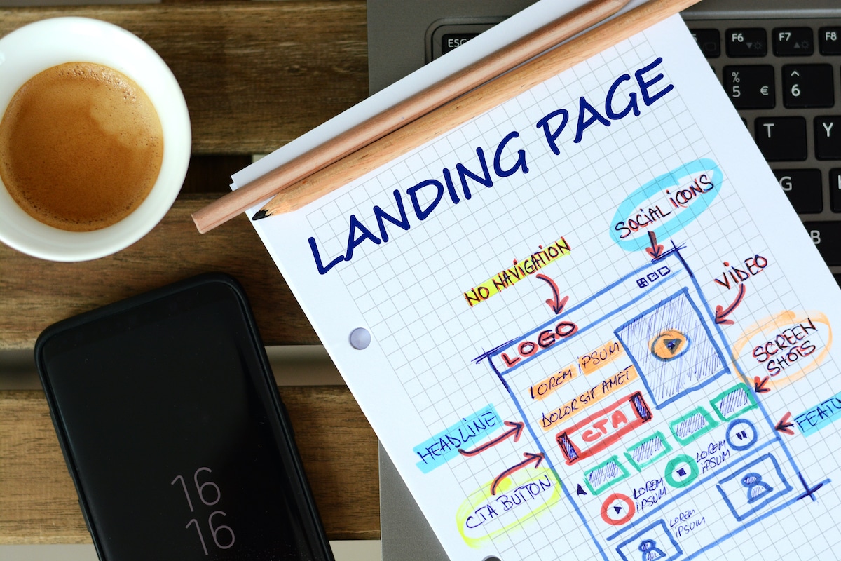
That new website is, in actuality, a landing page that’s built specifically to welcome anyone arriving from that particular link.
Landing pages do not have any purpose other than building up a call-to-action and providing education to the user. They are promotional pages that further stress the marketing material that compelled you to click in the first place. And now that you are there, it’ll do its best to take you down the sales funnel.
But as marketers will tell you, that’s easier said than done. It’s often a struggle to create landing pages that encourage visitors to take action and convert.
According to sources, the estimated average conversion rate for landing pages is only 4.02%.
However, while the average is abysmal, there are landing pages out there enjoying much better numbers and greater sales overall.
Below are a few ways you can ensure the success of your landing page for better conversions.
Make it Mobile-Friendly
Reports indicate that 86% of the best-performing landing pages are mobile-friendly. More people are using the internet on their phones than on any other device, and making your landing page mobile-friendly will also increase its overall effectiveness.
Make a clear and focused call-to-action, and couple it with easy-to-read content. This tactic will make your landing page specific and efficient.
Although it is good practice to create a separate landing page for mobile devices, adopting mobile-friendly protocols may be beneficial for the desktop version of your page as well.
Create An Effective Headline
The headline is the first thing that the visitor will read, so it HAS to encourage them to read further! In fact, only two out of every ten people make the effort of reading beyond the headline, so you should definitely make sure that the headline gives the reader a good enough reason to keep reading.
The headline could create curiosity about the product, present the reader with an incentive, or just be precise and well-thought-out. Be unapologetically loud with your headline; make it big, bold, noticeable and hard to ignore.
A compelling headline is the foundation of a high-converting landing page, especially when you really understand your target audience, what their pain points are and what they want to hear.
Make An Offer
Sometimes even the most shabbily-made landing pages end up converting. A significant reason for that is the incentive, which is very important in maintaining the reader’s attention and compelling them to find out how to capitalize on their interests in your offering.
Some ideas of incentives would be:
- Give visitors a free trial
- Take $10 off their first purchase
- Offer newsletter subscription upon purchase
- Give readers access to partner services
A good incentive will take visitors deeper into the sales funnel, and that is what we want.
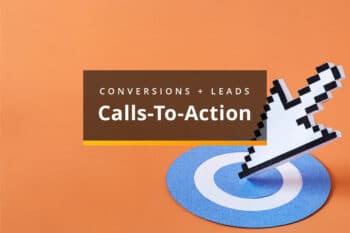
The most effective way to utilize an offer would be to place it in a personalized call-to-action. It makes a landing page 202% better at converting than one with a regular call-to-action.
Use Clean Visuals
Considering how the landing page is one focused webpage, it works to direct all attention towards your call-to-action.
Anything that distracts from that should be discouraged. This includes vivid and heavy imagery. A landing page should divert focus onto the product rather than the page itself.
Here are a few design tips to keep in mind:
- Use relevant imagery—or none at all. Don’t use a stock image just for the sake of having an image if no one will relate to it. It will only create a distraction from the real purpose of the page.
- Whatever the CTA is, be sure to introduce it high up on the page, preferably above the “fold” so that users can see it on their screen when they first arrive at the page. Burying it down at the bottom is not helpful when most people don’t make it that far down.
- Think about what the colors you choose are depicting. Keep colors not too dull and boring but not too distracting or cheesy looking.
- Isolating the call-to-action on an empty background may seem boring, but it has a higher chance of converting.
Vivid and expressive imagery also takes more time to load, depending on the user’s internet service. Your conversion chance can suffer a massive 7% decrease if there is a delay in loading by one second or more.
A surefire way to enhance the effectiveness of your landing page is by building a call-to-action focus into it. Minimize distractions, offer incentives early on and create easy-to-consume content that focuses on the benefits to the user.
You could be making a landing page for pay-per-click ads, social ads, game ads or an email marketing campaign; the tips we have mentioned are geared toward getting your visitors to convert no matter what your objectives are.
Get Help Getting More Conversions
At Sanctuary, we’re focused on getting results for our clients—that means figuring out the right ways to get you more leads and conversions. Let us help you put together well-rounded campaigns that point to a conversion-based landing page that gets potential customers to take action! Contact us today.

Related Articles:
Calls to Action: The Key to Website Conversions
When it comes to designing an effective website, the call to action (CTA) is a pivotal element, serving as a beacon to encourage conversions and…

Content Creation Ideas to Attract and Engage New Customers
Do you feel stuck trying to create new content without seeing the engaging results you were hoping for? Continuously producing engaging content is a challenge…

Maximizing Business Growth: The Power of Annual and Quarterly Planning
Regardless of a company’s size, planning is an essential step in growth and success. Digital marketing strategy plans serve as essential roadmaps toward growth and…


Most Popular Articles
Seeing Favicons in Your Google Search Results? Here’s Why…
Have you noticed anything different in your Google Search results lately? Google added tiny favicon icons to its organic search results in January. It was…
Business Growth and Digital Marketing News & Tips 4-14-24
Did you know? It’s five to twenty-five times more expensive to acquire a new customer than to retain an existing one. Increasing customer retention by…

Business Growth and Digital Marketing News & Tips 3-28-24
With the desire for precise measurement tools to determine ROI, there has been a rise in attention metrics. These metrics, which often utilize eye-tracking data,…